Valentines day is probably the holiday I spend the least amount of time and energy on, but this year I am really in the spirit.
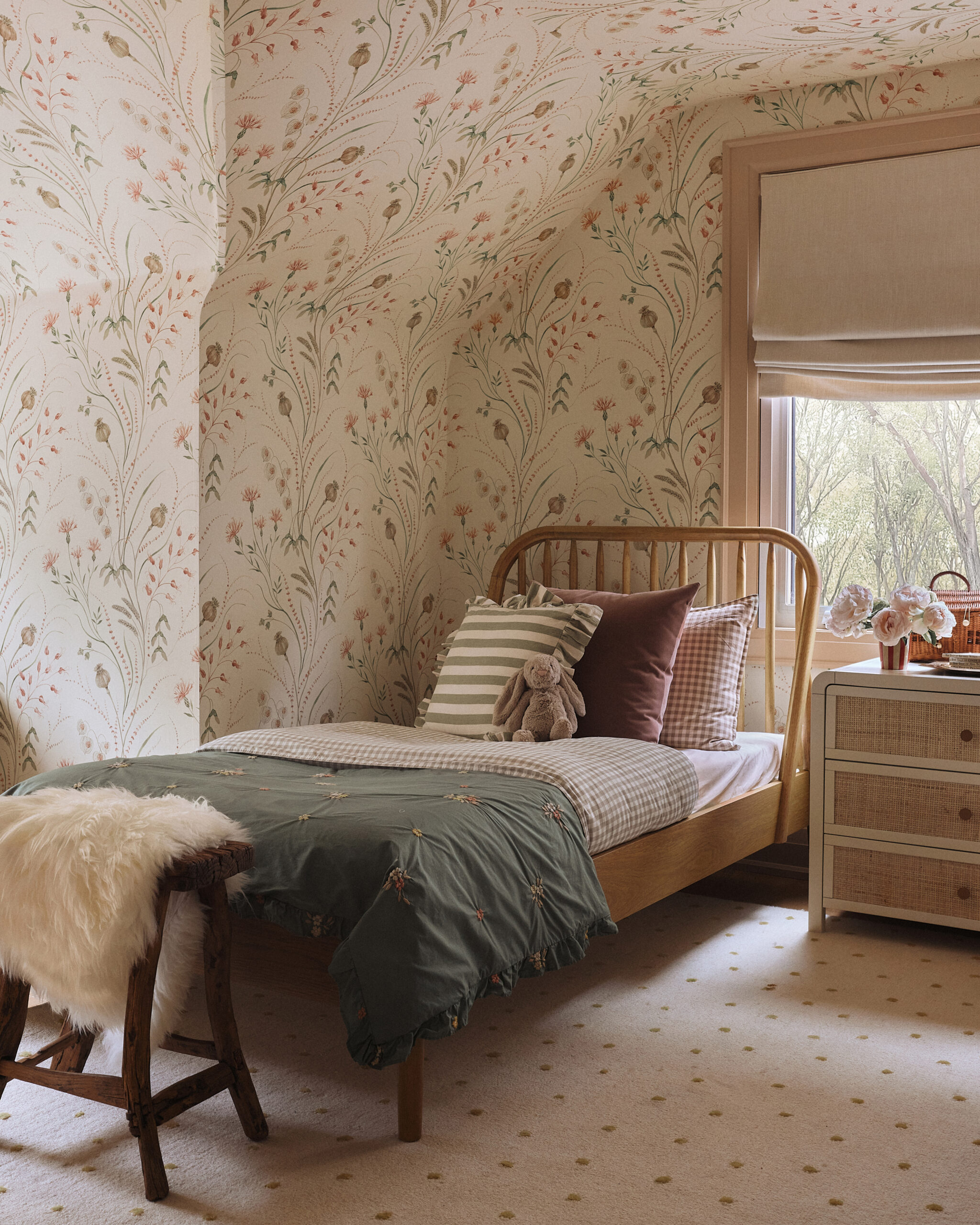
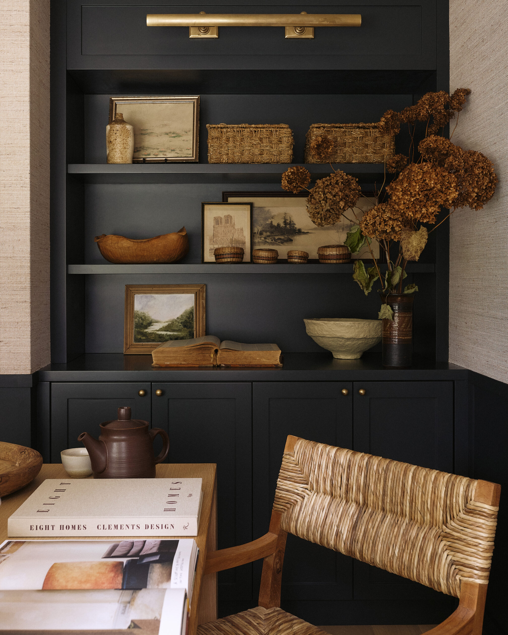
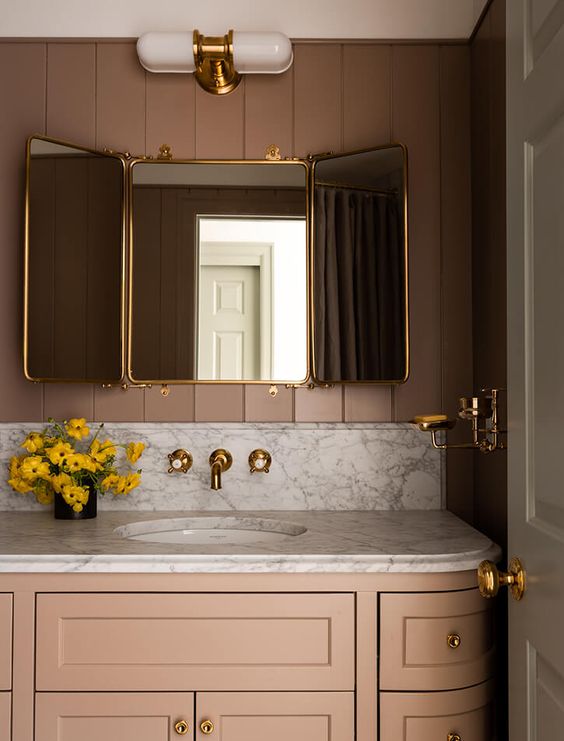
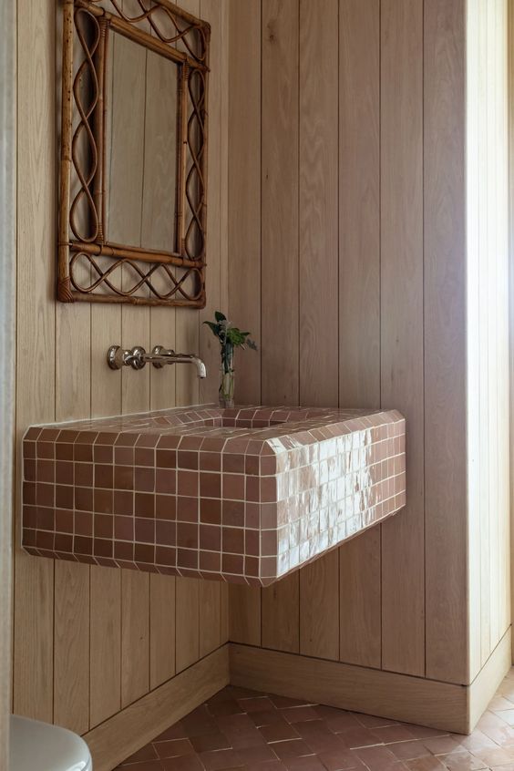
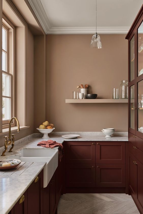
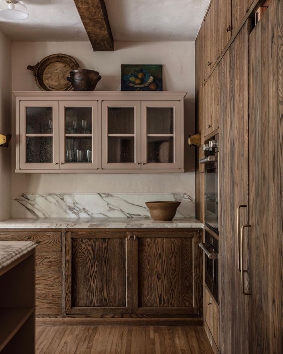
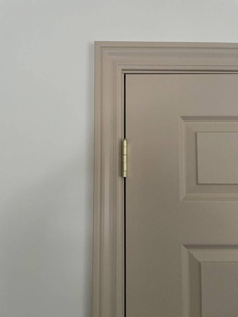
We love pinks and reds, but gravitate toward much more muted tones especially in interior selections. Here are some of our favourite interiors using elements of pinks and reds.
Colour & Our Emotions
Having spent a lot of my education (and life for that matter) studying colour, I love to nerd out about the psychology of colour!
Pink: pink is made up of a combination of red, white and blue. Passion and energy come from red, and you will get peace and tranquility from blue and white. This makes pink an all around calming colour. In colour psychology, pink is a sign of hope and is a positive colour that makes us feel warm and inspired.
Fun fact – the colour pink has been linked to reduced aggression and it’s even been used in holding cells for violent offenders!
Pink can be such an effective mood regulator that too much of it can be draining. Pale pinks are known to be very soothing.
Red: red is a primary colour and is the colour of passion and drama. It’s often associated with strong emotions such as love and anger. Colour psychologists have proven that red can increase blood pressure and stimulates the adrenal glands. The colour red is often used in colour therapy to reduce negative thoughts and release anger.
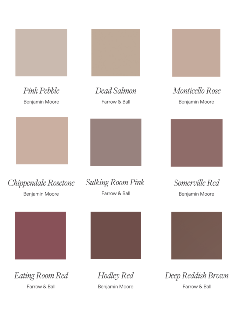
When it comes to interiors and design, I typically gravitate more to muted tones. My personal colour preferences and the way I engage with a space prefers this to bold and bright (especially in large coverage areas). Here are some of our favourite red and pink paint tones:
Do you have a favourite tone? Tell us in the comments! Happy Valentines day, everyone!